Nia Sallie
Mr. Busch
Yearbook 3, 1A
26 May 2018
Anatomy of Saul Bass's Poster
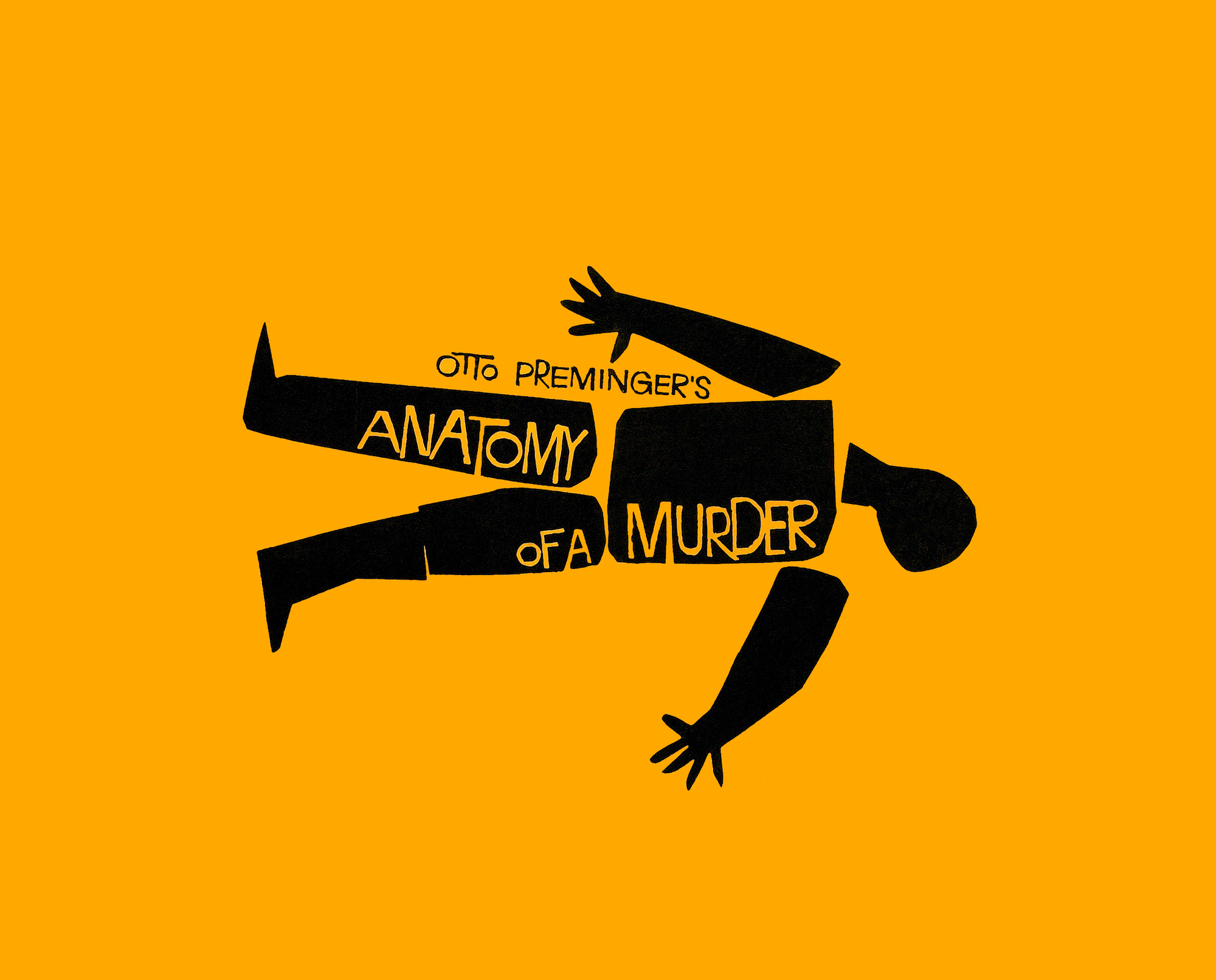
This iconic poster of Otto Preminger’s thriller "Anatomy of a Murder" was designed by Saul Bass in 1959. Saul Bass was a prolific graphic designer whose career spanned forty years. Not only did he create still images, but pushed the boundaries of design by taking advantage of the opening and ending scenes of movies. This genius is displayed in movies such as "The Shining" and "One, two, three" while inspiring later pieces such as the opening of several James Bond movies.
The poster depicts a dismembered person laying down in the center, with a saturated and harsh palette of only two colors: black and orange. He develops a brand identity of crazed letters which are a recurring theme throughout much of his work. In this particular piece, every thing drawn with a solid line. Nothing gradient, nothing subtle.
Saul Bass used digital media, hand cut, and hand painted techniques to achieve his designs. For the "Anatomy of a Murder" poster, distinctive features include the strong art, use of color, and the unique typeface. The typography reflects an unsettling feeling. The kerning is irregular, and this reflects the feeling of the movie--unsettling. The sans serif typeface evokes a modern feel which deviates from a classical feel, suggesting the unpredictable nature of the subject. The legibility is not so great, which also reflects the confusing and fascinating story line, perhaps reflecting a jumbled mind, like the protagonist of the film.
The contrast of the vibrant orange and black are jarring, and bring attention to the poster. The orange symbolizes violence, craziness, and strong emotions, eliciting a response from the audience. The dismembered body is not only grisly but foreboding. This uneven balance and proportion of words and sections of the body communicate a message of messiness and complications. This poster conveys many key elements of Otto Preminger’s story, with little words and subtle placement. This a testament to Saul Bass’s great talent.
Saul Bass created this poster to draw in an audience and introduce a new movie to them. This piece conveys the dark and twisted world of the movie through jarring colors, irregular typography, and bold lines. The evidence can be seen by the typical use of orange for heated scenes, and a maniacal typeface reminiscent of handwriting of someone who has gone mad.
This piece is an effective glimpse into the movie. It does it’s job well, the job to bring in an audience and leave them wanting more. Therefore, I would judge it as a good piece. The most important criteria include if it can convey the proper message, which it does, and my outside knowledge of the movie can affirm the preciseness of the feelings evoked simply from the poster. This poster is an exemplary sample of graphic design, which at it’s best can manipulate human emotions and affect an audience’s thinking.
Mr. Busch
Yearbook 3, 1A
26 May 2018
Anatomy of Saul Bass's Poster
This iconic poster of Otto Preminger’s thriller "Anatomy of a Murder" was designed by Saul Bass in 1959. Saul Bass was a prolific graphic designer whose career spanned forty years. Not only did he create still images, but pushed the boundaries of design by taking advantage of the opening and ending scenes of movies. This genius is displayed in movies such as "The Shining" and "One, two, three" while inspiring later pieces such as the opening of several James Bond movies.
The poster depicts a dismembered person laying down in the center, with a saturated and harsh palette of only two colors: black and orange. He develops a brand identity of crazed letters which are a recurring theme throughout much of his work. In this particular piece, every thing drawn with a solid line. Nothing gradient, nothing subtle.
Saul Bass used digital media, hand cut, and hand painted techniques to achieve his designs. For the "Anatomy of a Murder" poster, distinctive features include the strong art, use of color, and the unique typeface. The typography reflects an unsettling feeling. The kerning is irregular, and this reflects the feeling of the movie--unsettling. The sans serif typeface evokes a modern feel which deviates from a classical feel, suggesting the unpredictable nature of the subject. The legibility is not so great, which also reflects the confusing and fascinating story line, perhaps reflecting a jumbled mind, like the protagonist of the film.
The contrast of the vibrant orange and black are jarring, and bring attention to the poster. The orange symbolizes violence, craziness, and strong emotions, eliciting a response from the audience. The dismembered body is not only grisly but foreboding. This uneven balance and proportion of words and sections of the body communicate a message of messiness and complications. This poster conveys many key elements of Otto Preminger’s story, with little words and subtle placement. This a testament to Saul Bass’s great talent.
Saul Bass created this poster to draw in an audience and introduce a new movie to them. This piece conveys the dark and twisted world of the movie through jarring colors, irregular typography, and bold lines. The evidence can be seen by the typical use of orange for heated scenes, and a maniacal typeface reminiscent of handwriting of someone who has gone mad.
This piece is an effective glimpse into the movie. It does it’s job well, the job to bring in an audience and leave them wanting more. Therefore, I would judge it as a good piece. The most important criteria include if it can convey the proper message, which it does, and my outside knowledge of the movie can affirm the preciseness of the feelings evoked simply from the poster. This poster is an exemplary sample of graphic design, which at it’s best can manipulate human emotions and affect an audience’s thinking.
